12 July 2024
Total Design develops a unique, contemporary, and sustainable identity for Foto Festival Naarden (FFN)

The Foto Festival Naarden (FFN) is the first and oldest photo festival (1989) in the Netherlands, serving as the birthplace of contemporary photography. FFN has an artistic antenna for the Netherlands and Belgium. The festival has the fortress as a unique and central base.
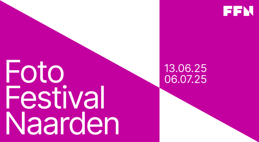
Photography is about beauty, composition, and perspective. These elements also form the basis for the visual identity of the Foto Festival Naarden (FFN).
“Viewing the world through someone else’s lens” has been taken as the starting point. The perspective approach is embraced in the identity and the powerful logo. The new logo of FFN is refined by the recognizable element from the design language, resulting in a visually cohesive whole that matches the complete visual identity of Foto Festival Naarden.
An important element of the identity is the visual language, the graphic pattern, which is derived from the principles of perspective. This visual language symbolizes the power of photography, broadening the view of the target audience and providing new insights. It creates a bridge between our own world of experience and the diverse perspectives that photography offers us.
In the visual language and the grid, we start from the Golden Ratio. This ensures an aesthetic balance for the placement of typography and images. It also provides FFN with a guide for the placement of elements.
At the corporate level, we use magenta, white, and black as primary colors. The color magenta has a promotional role. When communicating with photography, we use stone red, and green. These color tones have a connection with Naarden Fortress and also ensure that the artworks are highlighted in their strength.
Maarten den Ottolander – Board member FFN:
We were looking for a partner who could help us develop a powerful brand identity and house style in a short time. Without any reservation, we approached TD because I knew from experience that they could do this like no one else. The most important thing for me is the professionalism of the briefing and the quality of the creative work. And TD has proven this again with the result, with which we as FFN could immediately present ourselves professionally and recognizably to the festival’s financiers, marketers, and after the summer, to our target audience. And it worked immediately!


